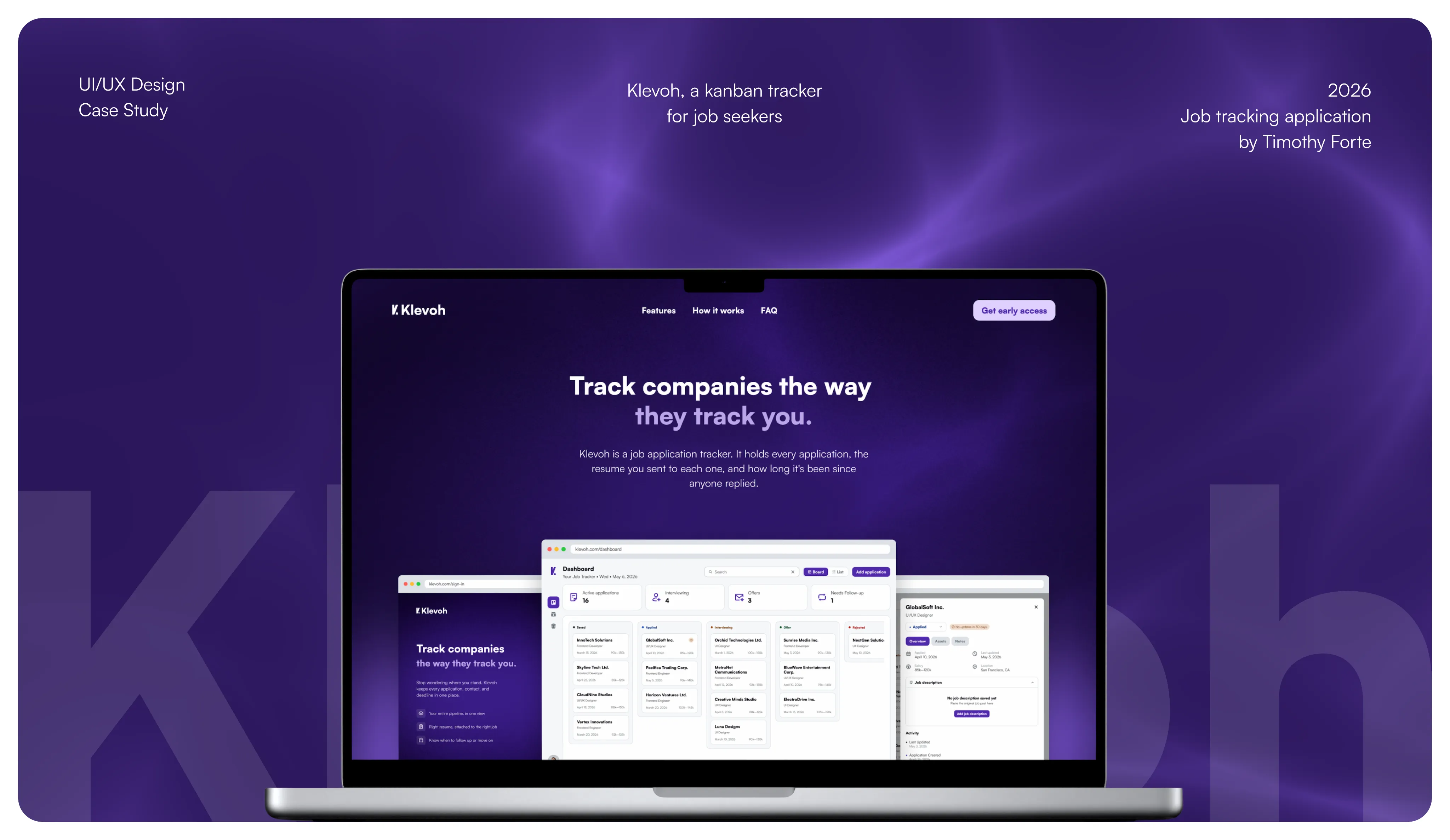
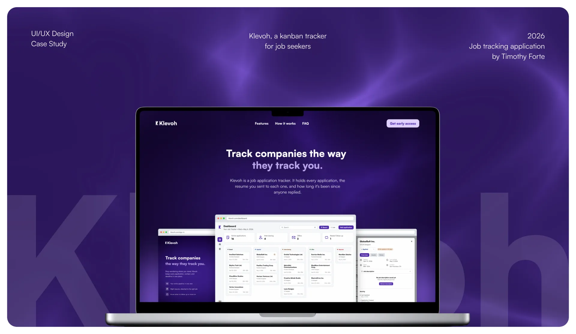
Klevoh - a job application tracker for job seekers
About
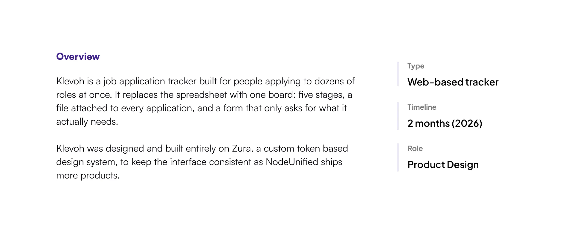
Klevoh is a job application tracker built for people applying to dozens of roles at once. It replaces the spreadsheet with one board: five stages, a file attached to every application, and a form that only asks for what it actually needs.

Klevoh was designed and built entirely on Zura, a custom token based design system, to keep the interface consistent as NodeUnified ships more products.
Design decisions
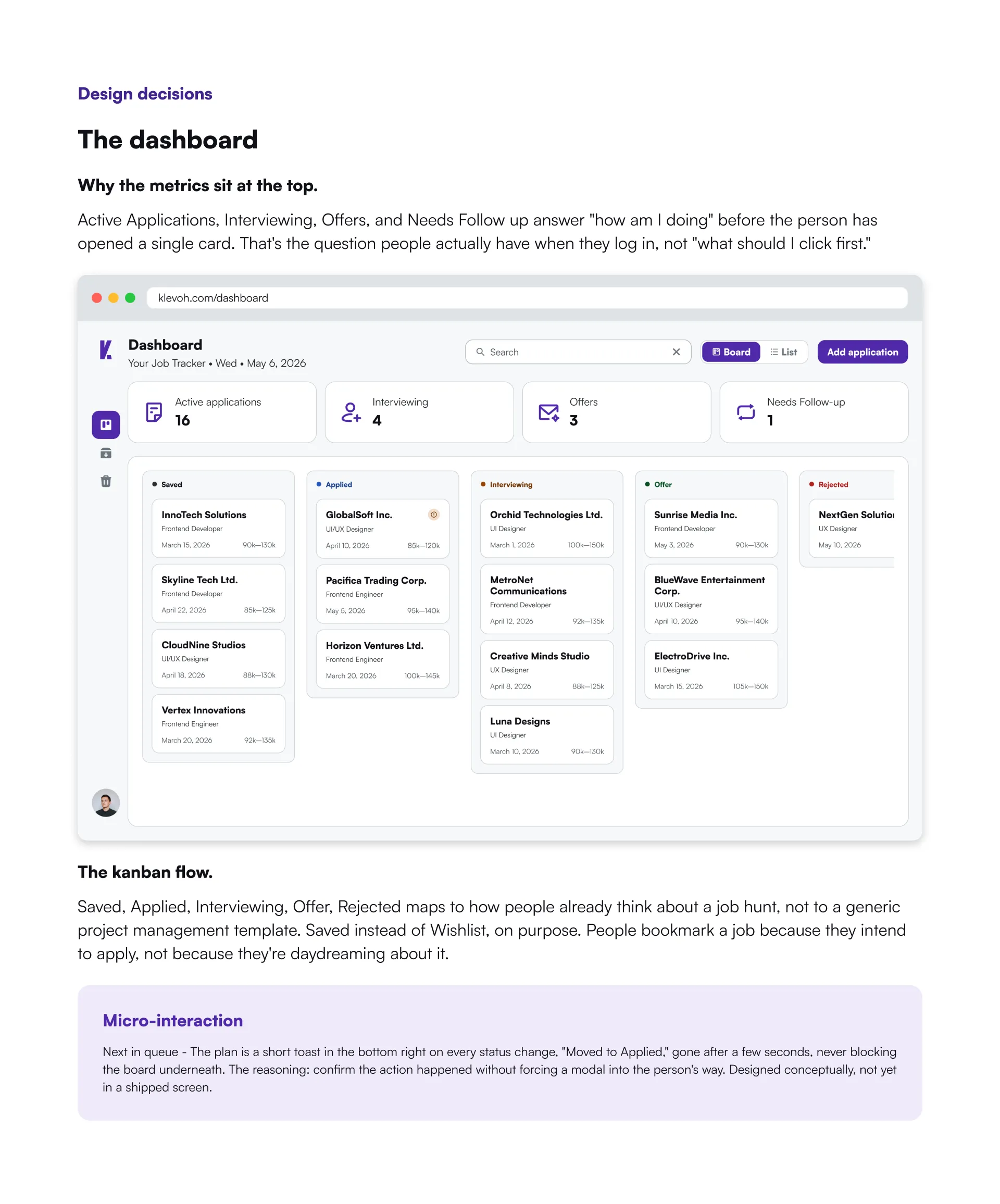
Why the metrics sit at the top.
Active Applications, Interviewing, Offers, and Needs Follow up answer "how am I doing" before the person has opened a single card. That's the question people actually have when they log in, not "what should I click first."
The dashboard
The kanban flow
Saved, Applied, Interviewing, Offer, Rejected maps to how people already think about a job hunt, not to a generic project management template. Saved instead of Wishlist, on purpose. People bookmark a job because they intend to apply, not because they're daydreaming about it.
Micro-interaction
Next in queue - The plan is a short toast in the bottom right on every status change, "Moved to Applied," gone after a few seconds, never blocking the board underneath. The reasoning: confirm the action happened without forcing a modal into the person's way. Designed conceptually, not yet in a shipped screen.
Engineering & deployment
The landing page shipped first, on purpose
Klevoh.com is live now, deployed on Vercel. It's the landing page, not the full tracker. That sequencing was deliberate: get a real, working signup surface in front of people while Phase 1 of the product finishes design and works through an internal QA pass, instead of waiting for the whole build to be launch-ready before anything is public.
The rest of the handoff runs through the token layer, not a static spec doc. A developer building a button never picks a color. They reference bg/interactive-primary and the system resolves it to the right value for light or dark mode. Structured Figma Make prompts gave the frontend team a way to rebuild all 34 screens for a consistency pass and catch drift before code review instead of after.
Where it stands
Live in one place, in progress in the rest
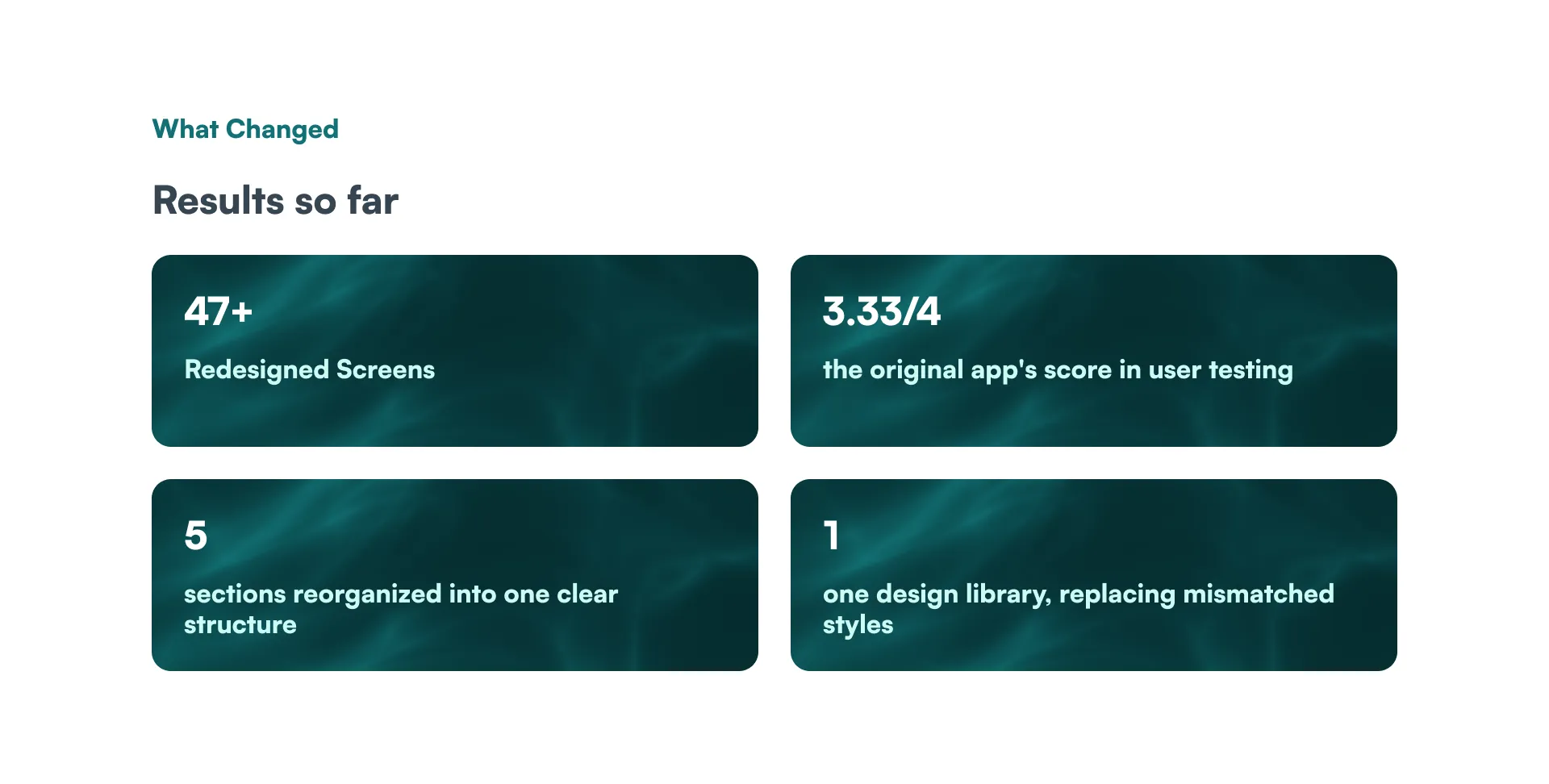
The landing page is live at klevoh.com and collecting early access signups. The product itself, 34 screens across auth, onboarding, the board, and the job card, is fully designed and in active development, with an internal heuristic review already run against it before a single line of the frontend was final.
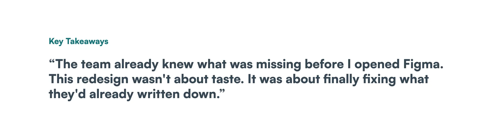
What I'd take from this. Shipping the landing page before the product, instead of after, was the right call, and I didn't plan it that way from day one, it fell out of needing something real to point people to. Sequencing beats completeness when the goal is early signal. I'd design the launch order on purpose next time, not back into it.